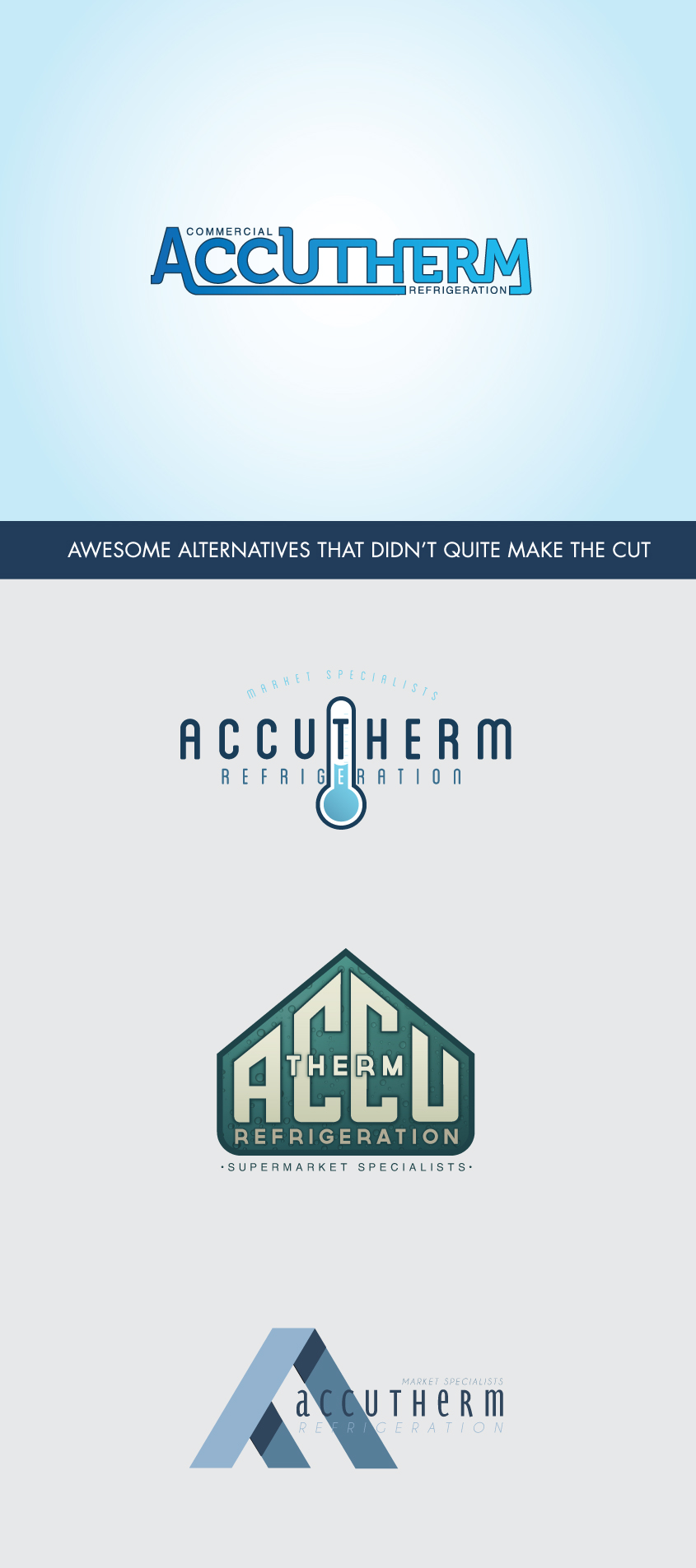
Accutherm is a local commercial refrigeration company that does everything from installing and servicing to designing and engineering refrigeration units. As a rapidly growing company, they wanted an updated logo that better represented their company. They felt the old logo was dated and were looking to upgrade. After a broad range of logo styles were submitted, they chose this bold blue typography based design that plays off of a refrigerator’s condenser. Also included are some of the runners up.
Accutherm Rebranding


